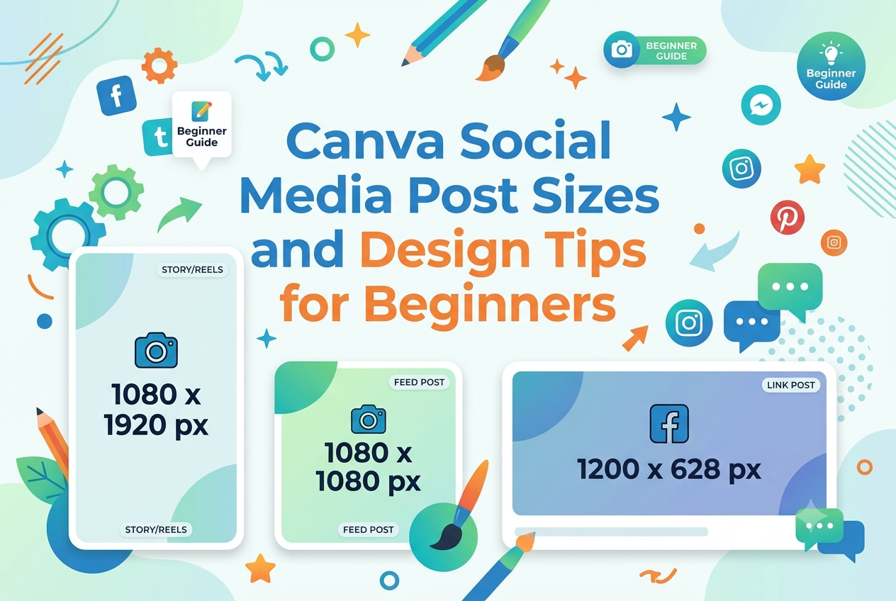
Canva is one of the most user-friendly design tools available. With easy templates, drag-and-drop functionality and correct sizing for almost all social platforms, you can ensure your posts look professional, load quickly and gain more engagement by using the correct Canva social media post sizes. Canva templates are pre-designed with popular social media sizing so you can focus on designing your message and style without having to resize your images.
In this guide we will show you the most useful Canva post sizes for social media, how to choose the right size and tips for beginner designs to create clean, branded and shareable graphics.
Why Social Media Post Sizes Matter
Every social media platform displays images differently. A square image may look perfect on Instagram, but it can get cropped awkwardly on YouTube, LinkedIn, or Pinterest. Using the correct size helps your design appear fully visible, avoids blurry images, and makes your content look more trustworthy.
Canva recommends optimising images for different social networks because each platform requires different dimensions. It also provides social media templates formatted for the ideal size of each network.
For beginners, the safest approach is simple:
- Use 1080 x 1080 px for general square posts.
- Use 1080 x 1350 px for vertical Instagram and Facebook feed posts.
- Use 1080 x 1920 px for Stories, Reels, and short vertical videos.
- Use 1200 x 627 px or 1200 x 630 px for link-style posts.
- Use 1280 x 720 px for YouTube thumbnails.
Most social feeds work best with images that are at least 1080 pixels wide, especially vertical formats that take up more screen space on mobile.
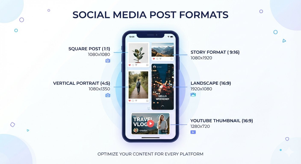
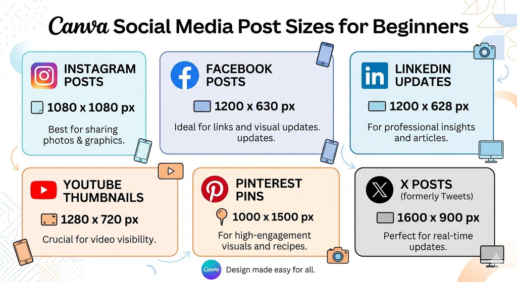
Canva Social Media Post Sizes Chart
Here is a practical size chart you can use while creating posts in Canva.
| Platform | Content Type | Recommended Size |
| Square post | 1080 x 1080 px | |
| Vertical feed post | 1080 x 1350 px | |
| Story / Reel cover | 1080 x 1920 px | |
| Square post | 1080 x 1080 px | |
| Vertical feed post | 1080 x 1359 px | |
| Link post image | 1200 x 630 px | |
| Cover photo | 820 x 312 px | |
| Landscape post | 1200 x 627 px | |
| Vertical post | 1080 x 1350 px | |
| Company banner | 1128 x 191 px | |
| X / Twitter | Single image post | 1600 x 900 px |
| X / Twitter | Header image | 1500 x 500 px |
| YouTube | Thumbnail | 1280 x 720 px |
| YouTube | Channel banner | 2560 x 1440 px |
| Standard Pin | 1000 x 1500 px | |
| Idea Pin / vertical Pin | 1080 x 1920 px |
Canva’s carousel guide lists Instagram vertical feed posts at 1080 x 1350 px, Facebook vertical feed posts at 1080 x 1359 px, and LinkedIn landscape posts at 1200 x 627 px.
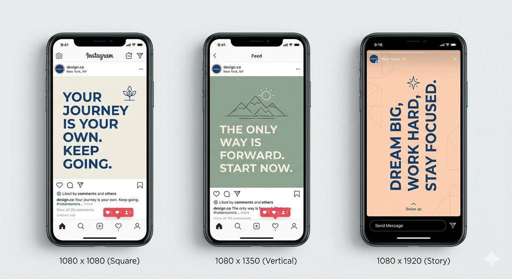
Best Canva Sizes for Instagram
Instagram is a visual-first platform, so choosing the right dimensions can strongly affect how your post performs.
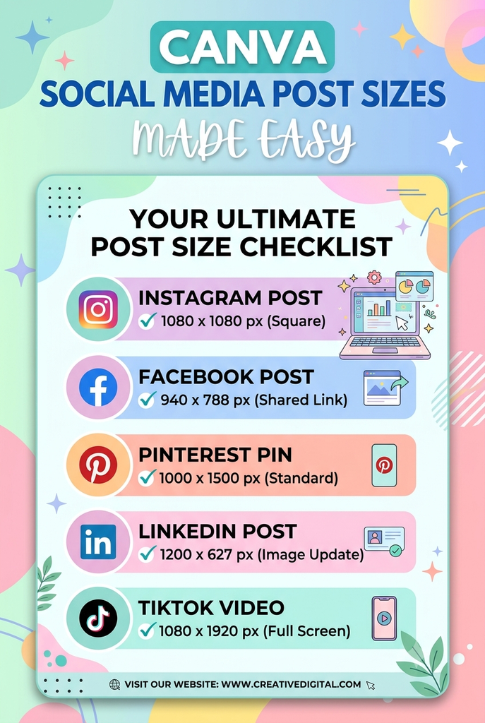
Instagram Square Post: 1080 x 1080 px
This is the most versatile size. It works well for quotes, tips, product highlights, announcements, and simple educational graphics. Square posts are easy to reuse on Facebook and LinkedIn.
Instagram Vertical Post: 1080 x 1350 px
Vertical posts occupy more space in the mobile feed, which can help your design stand out. Canva specifically identifies 1080 x 1350 px as the current vertical Instagram feed size.
Use this size for:
- Step-by-step tips
- Before-and-after graphics
- Checklists
- Carousel posts
- Blog post promotions
Instagram Story and Reel Cover: 1080 x 1920 px
Stories and Reels are full-screen vertical formats. Keep important text, faces, and buttons away from the top and bottom edges because platform icons may cover them.
Best Canva Sizes for Facebook
Facebook supports many image formats, but the two most useful sizes for beginners are square posts and link-preview images.
Facebook Square Post: 1080 x 1080 px
Use this for quotes, updates, promotional graphics, event reminders, and community posts. It displays cleanly in most feeds.
Facebook Vertical Post: 1080 x 1359 px
A vertical Facebook post gives your design more feed space. Canva lists 1080 x 1359 px as the vertical Facebook feed size.
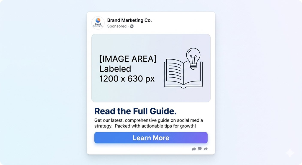
Facebook Link Post: 1200 x 630 px
If you are sharing a blog post, product page, or landing page, use a landscape image around 1200 x 630 px. This format works well for clickable links and website promotions.
Best Canva Sizes for YouTube
YouTube thumbnails are extremely important because they decide whether people click your video.
YouTube Thumbnail: 1280 x 720 px
Use 1280 x 720 px for YouTube thumbnails. Keep the text large, use high contrast, and avoid adding too many details. A good thumbnail should communicate the video topic in one glance.
YouTube Channel Banner: 2560 x 1440 px
Your channel banner should clearly show what your channel is about. Include your channel name, upload schedule, and a short value proposition, but keep the central area simple because different devices crop banners differently.
Image Prompt:
A YouTube thumbnail design template for beginners, sized 1280 x 720 px. Show a bold headline such as “Canva Tips for Beginners”, a large arrow pointing to a simple laptop illustration, high-contrast colours, and only three to five words of text. The layout should look clickable, clean, and mobile-friendly.
Best Canva Sizes for LinkedIn
LinkedIn works best with professional, informative, and value-driven graphics.
LinkedIn Landscape Post: 1200 x 627 px
This is a strong format for blog promotions, industry tips, statistics, and professional announcements. Canva identifies 1200 x 627 px as the LinkedIn landscape feed size.
LinkedIn Vertical Post: 1080 x 1350 px
Vertical posts can work well for carousels, career advice, business tips, and educational content. They take up more mobile screen space and can improve readability.
LinkedIn Banner: 1128 x 191 px
Use your LinkedIn banner to introduce your personal brand or business. Add your niche, website, or a short professional tagline.
Best Canva Sizes for Pinterest
Pinterest favors tall, vertical images because they take up more space in the feed.
Pinterest Standard Pin: 1000 x 1500 px
This 2:3 ratio is ideal for blog graphics, recipes, checklists, infographics, and step-by-step guides. Add a clear headline, a strong image, and a small website name or logo.
Pinterest Idea Pin: 1080 x 1920 px
Use this vertical format for multi-page guides, tutorials, and story-style content. Keep each page focused on one idea so viewers can easily follow along.
Best Canva Sizes for X / Twitter
X moves quickly, so your image should be simple and instantly understandable.
X Post Image: 1600 x 900 px
This landscape format works well for announcements, quotes, tips, and blog links. Keep the main message in the center so it does not get cropped in the timeline.
X Header Image: 1500 x 500 px
Use your header to show your brand personality. Include your niche, website, or a simple tagline, but avoid placing important text near the edges.
Beginner Canva Design Tips That Make Posts Look Professional
Using the right size is only half the work. Good design helps people stop scrolling, understand your message, and take action.
1. Keep One Main Message Per Post
Do not try to explain everything in one graphic. Each post should communicate one clear idea. For carousels, Canva recommends giving each slide one clear idea, with the opening slide setting expectations, middle slides building the story, and the final slide delivering the main point.
For example, instead of designing one post called “Complete Canva Guide”, create separate posts such as:
- “5 Canva Fonts for Clean Social Media Posts”
- “How to Resize a Canva Design”
- “Canva Colour Palette Ideas for Beginners”
- “How to Make a YouTube Thumbnail in Canva”
2. Use Large, Readable Text
Most people view social media content on mobile phones. Your headline should be large enough to read without zooming. Use a clear hierarchy:
- Main headline: largest
- Supporting text: medium
- Extra details: smallest
Canva advises keeping text clear and simple, using colour contrast for legibility, and using visual hierarchy to grab attention.
3. Use High Contrast Colours
High contrast makes text easier to read. Dark text works well on light backgrounds, while white or light text works well on dark backgrounds. Avoid placing light-coloured text over busy photos unless you add a dark overlay.
A simple beginner formula is
- One background colour
- One main text colour
- One accent colour
For example, use a white background, dark navy text, and a bright coral button or highlight.
4. Follow Consistent Branding
Consistent fonts, colours, and image styles help people recognise your content instantly. Canva highlights that consistent branding can be achieved by using the same fonts, colours, or images across social media designs.
Create a simple brand kit with:
- Two fonts
- Three brand colours
- One logo version
- One preferred photo style
- One recurring layout style
For example, if your blog uses blue and white, avoid suddenly switching to neon green and red unless it fits a special campaign.
5. Use White Space
White space, also called negative space, is the empty area around text and images. It makes your design feel less crowded and helps the main message stand out. Canva’s design guidance emphasises balance, composition, spacing, and keeping designs simple rather than overloading them with elements.
If your design feels messy, remove one element, increase spacing, or reduce the amount of text.
Image Prompt:
A minimalist design tutorial graphic titled “Use White Space”. Show a crowded social media post on the left and a clean version on the right. Include arrows pointing to spacing between the headline, image, and call-to-action. Use a soft neutral colour palette.
6. Start With Canva Templates
Templates save time and help beginners avoid poor layouts. Search Canva for terms like “Instagram post,” “Pinterest pin,” “YouTube thumbnail,” or “LinkedIn carousel.” Then replace the sample text, images, and colors with your own content.
Canva explains that templates are a starting point: you can change the words, fonts, colors, images, and layout until the design fits your needs.
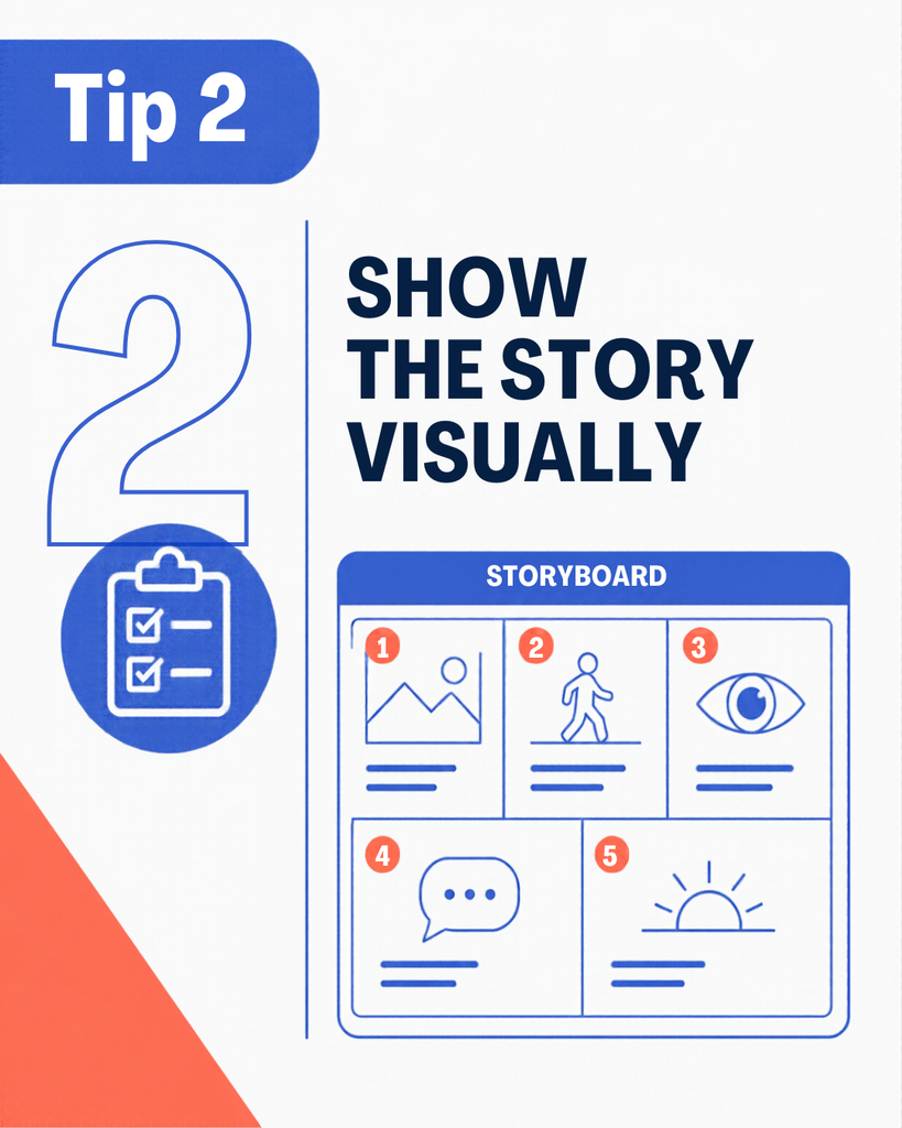
7. Design Carousels With a Clear Flow
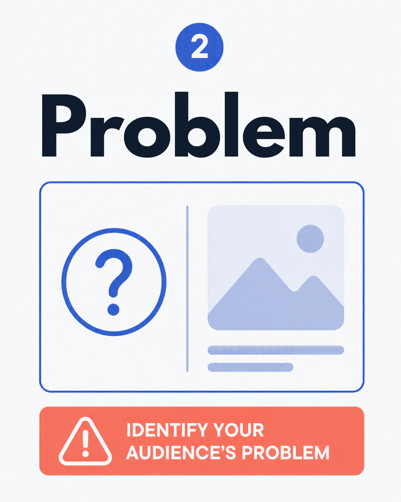
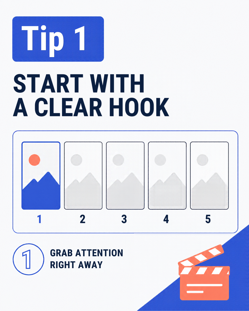
Carousels are excellent for tutorials, tips, and step-by-step guides. A strong carousel usually follows this structure:
- Slide 1: Attention-grabbing headline
- Slide 2: Explain the problem
- Slides 3–6: Share tips or steps
- Final slide: Summary and call-to-action
Canva notes that a clear opening sets expectations, middle slides build the story, and the final slide lands the point.
Image Prompt:

8. Add a Clear Call-to-Action
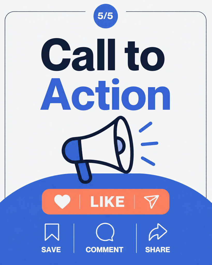
Every post should tell viewers what to do next. Use short CTAs such as:
- “Save this post”
- “Share with a friend”
- “Read the full guide”
- “Comment ‘CANVA’ for the template”
- “Visit the link in bio”
A call-to-action increases engagement and can send more traffic to your website. Canva also recommends adding CTAs to encourage users to share images.
How to Create a Social Media Post in Canva
Follow this simple process:
- Log in to Canva and click Create a design.
- Search for the platform name, such as “Instagram Post” or “YouTube Thumbnail.”
- Choose a template that matches your topic.
- Replace the text with your own headline and message.
- Upload your own image or choose a relevant stock photo.
- Adjust colors and fonts to match your brand.
- Add your logo or website name.
- Check spacing, contrast, and mobile readability.
- Download the design as PNG for images or MP4 for video.
- Publish or schedule your post.
Canva allows users to download image-only carousels as PNG files and video-based designs as MP4 files, or share directly to connected social platforms.
Common Canva Design Mistakes to Avoid
Beginners often make the same mistakes. Avoid these to improve your results:
- Using one design for every platform without resizing
- Adding too much text to one image
- Using more than two or three fonts
- Choosing colors with poor contrast
- Placing important text near Story or Reel edges
- Using low-quality or stretched images
- Forgetting your logo or website link
- Ignoring mobile preview before publishing
- Making every post look exactly the same
- Not using a call-to-action
Canva is one of the most user-friendly design tools available. With easy templates, drag-and-drop functionality and correct sizing for almost all social platforms you can ensure your posts look professional, load quickly and gain more engagement by using the correct Canva social media post sizes. Canva templates are pre-designed with popular social media sizing so you can focus on designing your message and style without having to resize your images.
In this guide we will show you the most useful Canva post sizes for social media, how to choose the right size and tips for beginner designs to create clean, branded and shareable graphics.
Stay Updated with Grow Tech Education
Digital Marketing, AI Tools, SEO aur Career Growth se related practical guides regular padhne ke liye hamari website visit karein.
Visit Grow Tech Education →Naye articles ke updates ke liye connected rahiye ✨